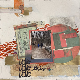
Covid has provided more opportunities for quiet treasured weekends with our boys, instead of running around to scheduled activities and family events. This warm winter weekend included hanging around the house, getting out for a walk along a local rail trail, and making hot chocolate bombs. I always wonder what they are talking about when I see them spending time together, and pray they will always love, support and confide in each other as they grow.

Humbled to be a guest designer for
Lasting Memories layout challenges for the Month of February. The theme this month is Techniques. Challenge #536 features using collage as a base or lots of layers.
I’ll be honest: I was most excited about this week’s challenge of the entire month, so I think the best was saved for last! When I think of collage I always think of one of my favorite artists,
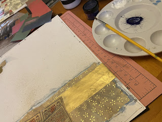
Robert Rauschenberg, and for some reason, I’ve never thought of incorporating much collage work on my layouts, but I suspect that will be changing very soon after this experience. I started by spraying the stark white Photoplay cardstock with Nuvo Antique Gold Mica Mist to dirty it up.

I noticed many of my favorite uTube scrappers were doing scrap challenges this month, and thought that would be a great place to start the collage work. I did a deep dive into my scraps stash dive and found two sets of decade old scraps that I loved: an Asian inspired patterned paper and gold foiled papers of unknown origin. I was also gifted a small package of vintage ephemera that I have been saving for who knows what... so the printed cigarette tickets, data punch card, and Russian novel pages seemed like a good random mix of fonts and soft yellow color I was looking to start with as my base. I also bought a vellum phrase from Quick Quotes recently, and I’m not usually into mushy, sappy phrases on my layouts, but I find myself getting more and more sentimental as the time for my son to leave for college gets closer and closer. I knew I wanted to layer some print or pattern under the vellum.

Next, I glued down the first few layers and mixed some water, Vicki Boutin powdered blueberry pie pigment and Matte Acrylic Gel to make a thin paste and brushed it over the three paper and ephemera layers for a subtle blue effect. Then, I couldn’t resist trying out my new Dina Wakley Leafy stencil and Picket Fence paper glaze in marigold orange that happened to arrive the day before for a pop of color. I started layering paper behind the photo instead of a traditional mat, and also did the same with the vellum, and before adhering the photo, brushed all elements with the same collage mixture as described above, except I used the Watermelon Burst green tone pigment instead. I love that I can use these pigments with any white medium to create whatever color I want.
Finally, I added more scraps and ephemera to the background, used scraps I had from the new Vicki Boutin Storyteller collection to cut out a large circle and layered the Asian inspired paper on top, then brushed the acrylic gel on top without pigment this time. Finally, I added a title from Storyteller and metal details, which is something Rauschenberg incorporated in many of his pieces, as well as some Nuvo Belgium Bluestone Stone and Emerald Isle Vintage drops. Brads by studio G and Eyelet Outlet. Freehand lines and journaling with Artist’s Loft fine top black pen. Chaulking ink edges with Powderfuff feather grey and Staples date stamp.
I’ve been inspired to pull out some of the old calendars, cards, etc I’ve been hoarding over the years and start USING them with this technique on layouts. The reason I saved them is because I loved the images so it only makes sense to incorporate them into my work, instead of random ephemera that someone else choose on my behalf.
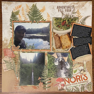
I made the page below a few weeks ago to document the same weekend together, and thought the complimentary circles of the sketches worked well together side by side. Although I often do double page layouts, I always try to think about how single pages will look together when documenting different subjects within a chronological yearly album by using similar colors, collections, and/or sketches. Here’s a link to that blog post:
Hot Chocolate Bomb.
sdm-
